Over the hour of this week’s lecture, we covered aspects of modernism in design history. Modernism is so broad and it’s interesting to get insight into such a major aspect of design. Although the term Graphic Design wasn’t used back in WW1, they had the general concepts of visual communication. During this time, propaganda posters and advertisements were introduced to encourage people to enlist in war. Women were eventually on propaganda posters to portray vulnerability and to show they needed protection.
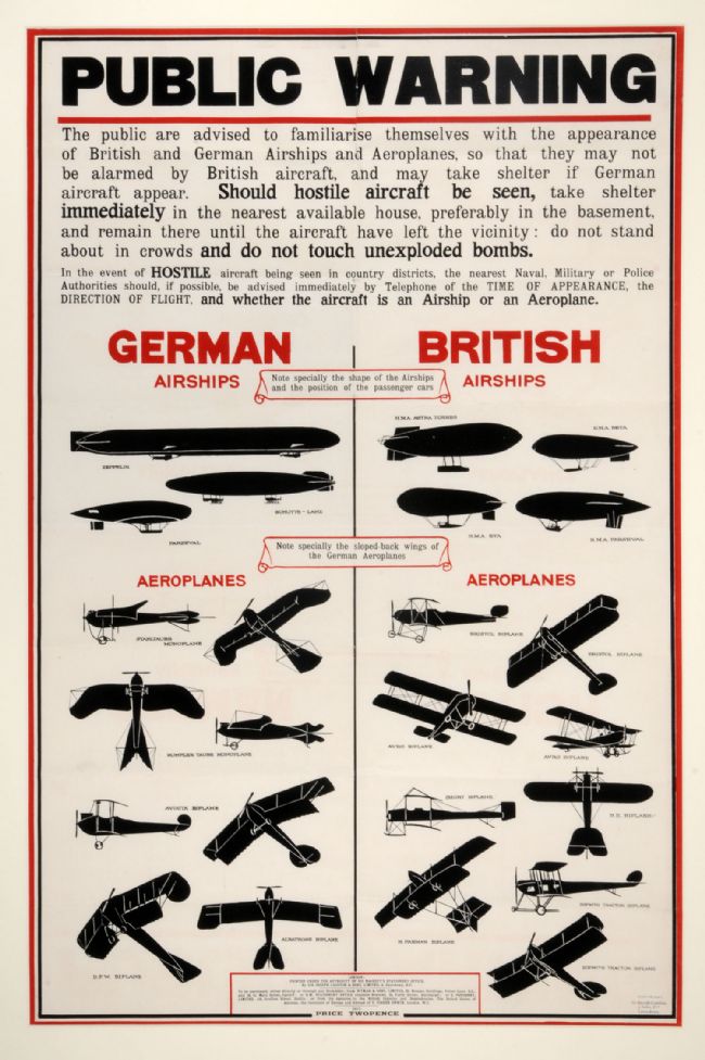
In the lecture, I found the contrast of graphic design in WW1 and WW2 most interesting. It’s evident how much new knowledge of design went into the propaganda posters of WW2. In the beginning, it’s interesting to see how dis advanced design was in the first war. Yet, impressive to see how they used as much knowledge as they could to send important messages out to the community. For example, posters were sent out with silhouettes of allied aircraft’s and the enemy’s aircraft’s. This was to educate the community on what to look for in the skies, to ensure safety. This was a great movement for visual communication design having a life saving effect on the public. Such instructive designs are advanced in WW2 and still to this day, for example, CPR instruction posters hung in a workplace or school.
